NOW WE'RE SCHEMING
- Feb 20, 2020
- 6 min read
Updated: Aug 11, 2021

I would imagine, if you had to ask a university maths professor to explain the equation 1+1, he'd probably just stand there blinking at you for a couple of seconds. 1+1 is basically as simple as it gets, and it’s quite hard to explain that in an easier way without sounding like a condescending prick. I sometimes feel that when it comes to designing or scheming with colour and pattern, some interior designers would probably think the same. Why do those colours work together? Why does that print work with that pattern but not the other? I don't know Janet! They just do! When I moved to London, and started working for the Queens of colour and pattern, Turner Pocock, I learned that there was in fact a simple way to answer all the how, what and why’s of colour and pattern, that didn’t involve calling anyone Janet. Turns out there is even a little bit of a formula...sort of. Before I get into it, this blog isn't about WHAT colour or pattern you should use together. Those change like the bloody wind. This is a blog on HOW to design with colour and pattern.
This is for people who love colour, adore pattern, but have no clue where to start.
There are loads of ways to begin a scheme. Loads. You can pick your favourite outfit, and use the colours in that to get the ball rolling. If you have a good enough piece of art that you want to use in the room, pick a few colours from there and build a scheme around that. Watch an episode of Queer Eye, and they will tell you to pick your favourite feeling and use that as the foundation for a room. Long story short, there are plenty of different ways to skin this cat.
What all of these ways are great for, is helping you pick your colour scheme. They take the guess work out of trying to decide what colours to go for, but what they don’t do, is answer the question of how to incorporate pattern into your design.
The solution to this?
Pick a fabric. More specifically, pick a fabric that has a pattern in it. Even more specifically than that, pick a fabric with a pattern, which also contains 3 colours or more.
For this example, it's grey, blue and ochre.

(For the sake of this blog, going forward I am assuming the fabric only has 3 colours, they can, and often do have more)
We call this fabric the lynch-pin.
It's up to you to decide how much of this pattern you want to see in the room. If you are all for pattern, use it as the curtains, the headboard, the sofa or even the wallpaper. If you are a little more cautious, maybe just use it as a footstool, or just some scatter cushions. Regardless of how it's used, the point is that this fabric is there to act as the sorting hat of colour, as well as the foundation for the further use of pattern. 2 birds, 1 colourful patterned stone.
You have picked your fabric, now what?
1) Starting with colour:
Getting your base colours right. Everybody can agree that zebras are white, with black stripes (work with me here) Why? Because it's generally perceived that colour is added to something, rather than removed. Same goes for fabric.
Taking the fabric you have chosen, you should be able to identify what the “base” colour is, and what the "added" colours are. In this instance, the base colour is a warm grey. 90% of the time, this base colour is also the lightest colour…just like white on a zebra.
You need to use this base colour as the reference colour for all your other neutral fabrics in the room.
Example, if the fabric has quite a warm undertone, make sure that any other plain fabrics you choose, have a base with the same warm tone. As soon as you start repeating the same base colour, no matter where you get the rest of your fabrics from, the design will start to feel holistic.

Of the remaining 2 colours, in this case blue and ochre, pick one that will now become the scheme, and one that will become the accent. Match all further selections to these 2 colours. So for example, I want my scheme to be predominantly blue, with the ochre being used as the accent colour.

As you piece the rest of the scheme together with other fabrics, repeat the blue colour on larger items, with the ochre being used for smaller things like piping, the backs of cushions or even on things like lamps or lamp shades.
The lynch-pin fabric is basically a mini version of your whole scheme. So I would suggest you pick one you love.
But Christian, how is this any different than picking out colours from the oil painting of my Nan?
Well Janet…Where picking colours from a piece of art might give you a colour palate to work with, using a lynch-pin fabric introduces a pattern from the offset. Colour and pattern have now become driving force of the scheme, and regardless of how much of the lynch-pin fabric you actually end up using, you now have a scheme with a pattern in it. A painting of your Nan can’t do that.
2) Moving on to pattern:
Pattern is a bit more of a tricky one. Regardless of their colour, patterns all have their own vibe about them, so it's nearly impossible for me to tell you which one is better than the other. I could try, but we would be here all week.
A paisley may read "Hugh Hefner", and a hounds-tooth more "Jackie O", but that isn't really much concern here. When it comes to mixing patterns, it’s all about scale and density, not their contribution to society.
Taking the three-coloured scheme we have started, we want to start picking additional prints and patterns within that colour palate. Using the blue as the predominant colour, look for 2 other patterned fabrics that have the same colour blue in them. More importantly however, the must have a different density or scale than the lynch-pin fabric.
Keeping in mind the zebra theory, make sure that the base colour of the new fabrics matches too.

In this instance the lynch-pin is a medium sized pattern, and sits perfectly between the 2 additional patterns. The stripe is quite a large scale pattern, with a lot of base colour between the blue, whereas the geometric pattern is smaller in scale, and the blue is far more densely packed.
Regardless of the physical size of the pattern, what is important, is that the lynch-pin is being used as the reference point in selecting all other patterns around it. You want to ensure diversity in scale. The biggest mistake when it comes to pattern is not paying attention to scale. If you make a concerted effort to not have more than 1 large, 1 medium and 2 small prints in a space you should be fine.
If you were to translate all the fabrics I've shown into a bedroom scheme, it would go a little something like this:
The curtains would be in the light grey herringbone, with the headboard in the blue and grey geometric. The lynch-pin fabric would be the scatter cushions on the bed, front and centre, with the stripe being used as a bed throw. Bringing in the ochre as the accent colour, I would maybe use this as the colour for the painted bedside lamp bases. In the corner of the room I would have a small armchair in the blue herringbone, and to tie that in with the rest of the scheme, maybe throw in a ochre velvet scatter cushion, or pipe the chair in a yellow trim.
6 different fabrics, 3 district patterns, but one simple and considered scheme.

Obviously the scheme I have mentioned still needs to be fleshed out a little with the the likes of paint colours, lampshade fabrics, and other bits and bobs, but if you follow the principle of referring each choice back to the lynch-pin, these choices are pretty easy to make.
A 3 colour lynch-pin is just the beginning when it comes to starting a scheme full of colour and pattern. Picking a lynch-pin fabric with 4 of 5 colours will only further add to the complexity and interest within the scheme. This will not only allow you to add additional accent colours, but will help introduce multiple patterns with multiple colours in each.
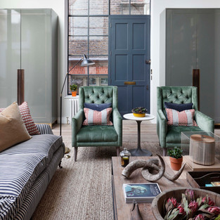
The lynch-pin fabric in the title picture above, may only have ended up being used on a small scatter cushion, but the 6 colours in there were used to select everything from the teal-green paint used on the walls, to the orange in the ceramic lamp and the red leather side table. It was also used to pick the green for the patterned armchair fabric. A far larger and dominating print, but one informed by the lynch-pin
Simply put, a lynch-pin fabric does all the work for you. Stick with 3 colours and you're golden, add, add, add and add, and you're playing with the big boys.